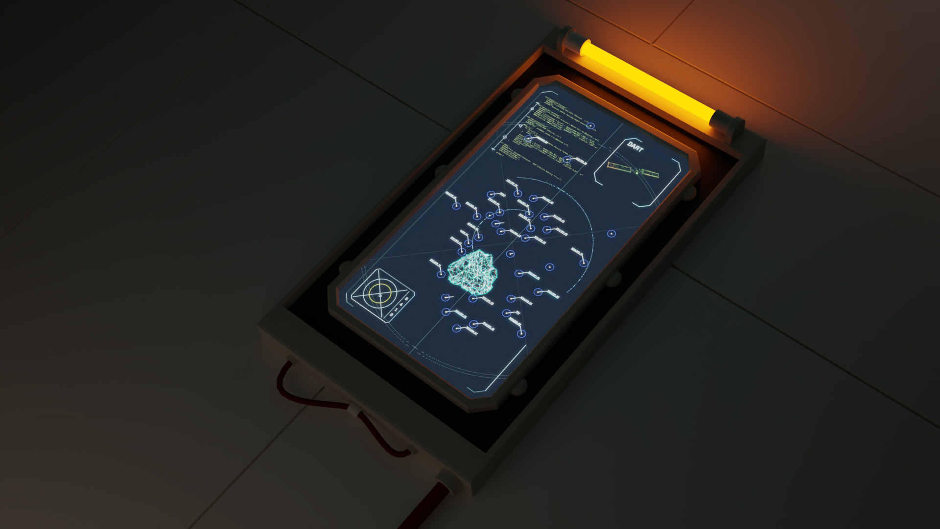
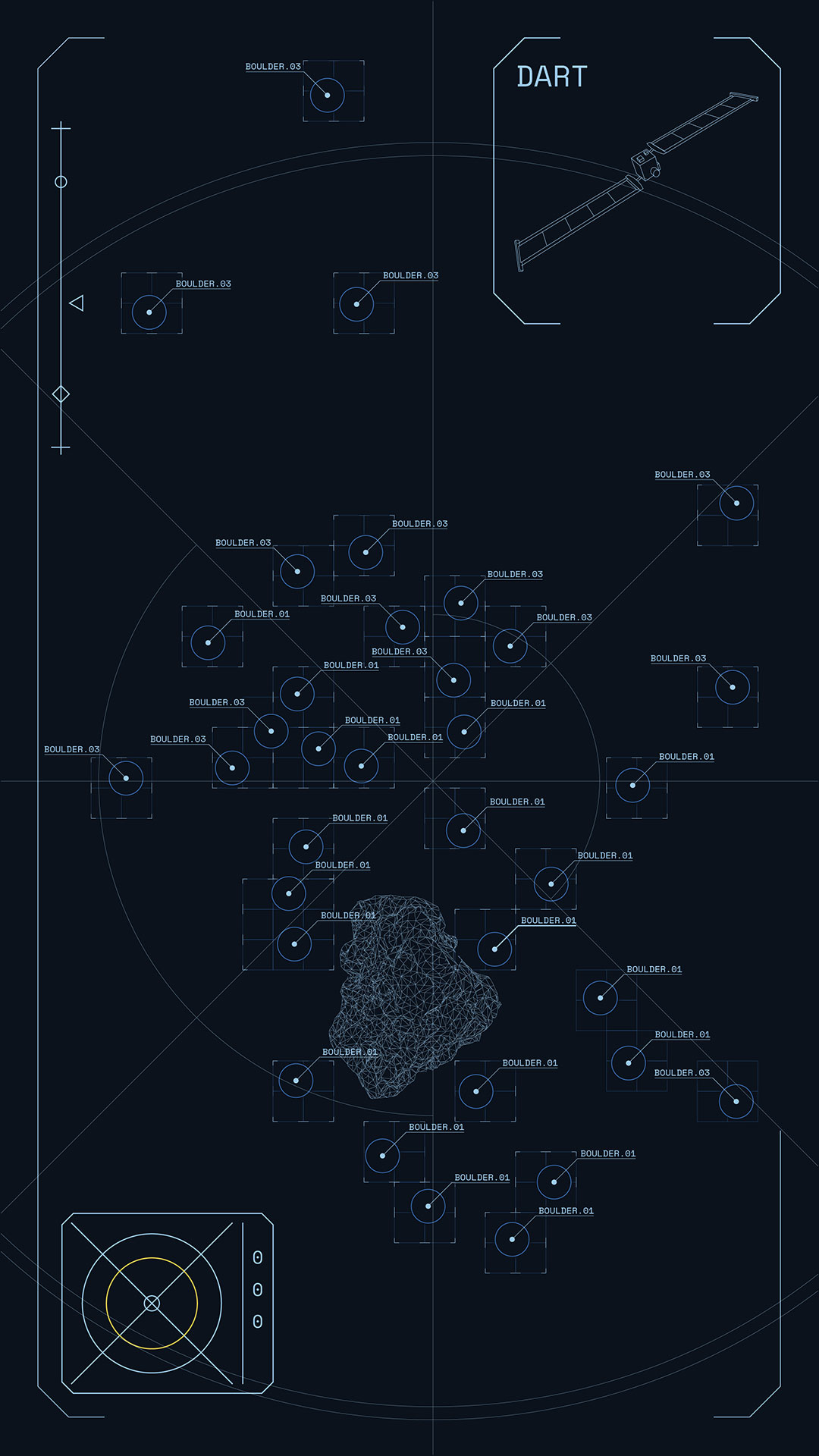
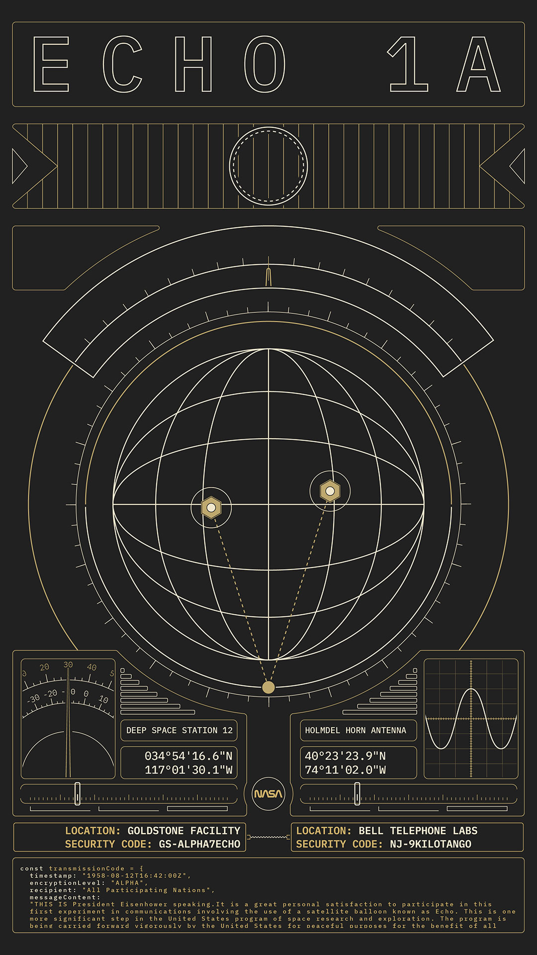
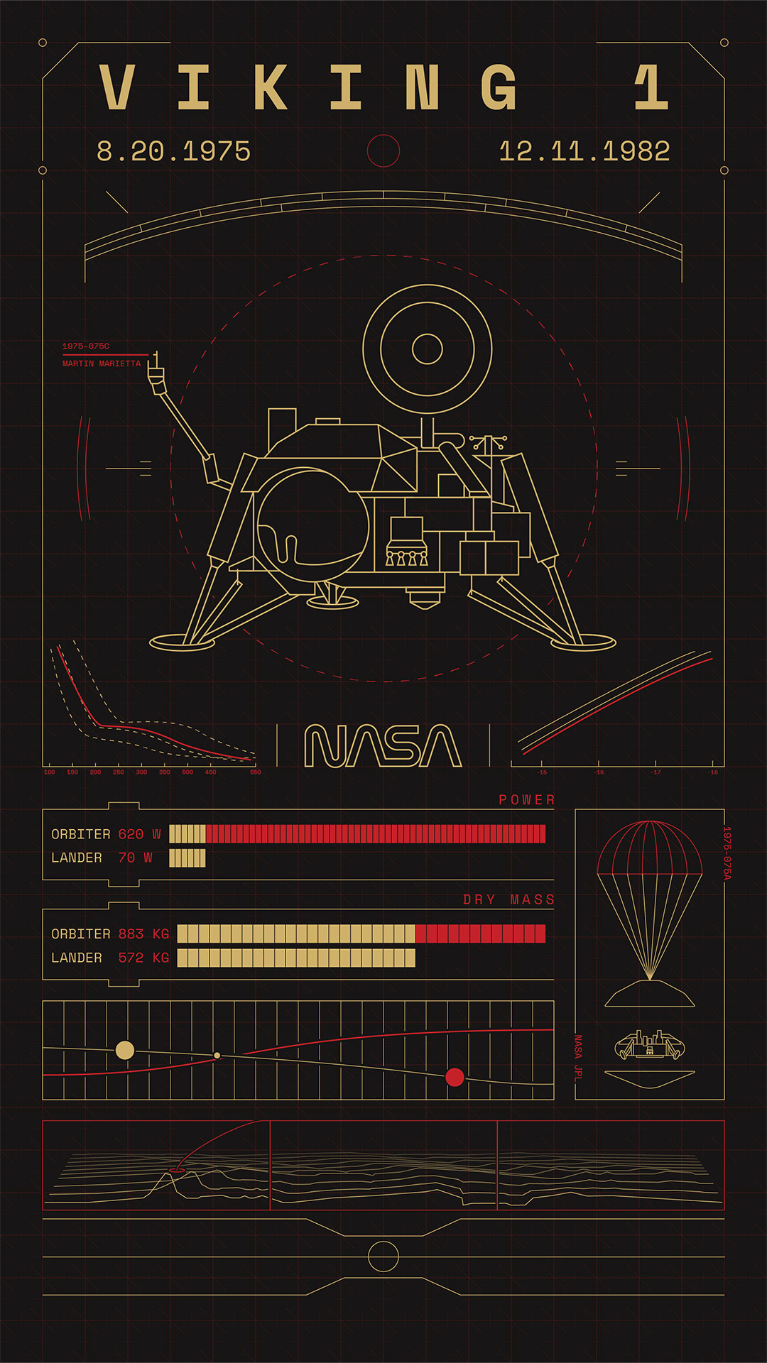
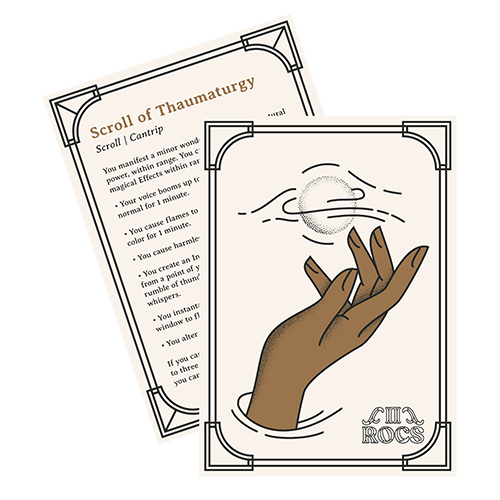
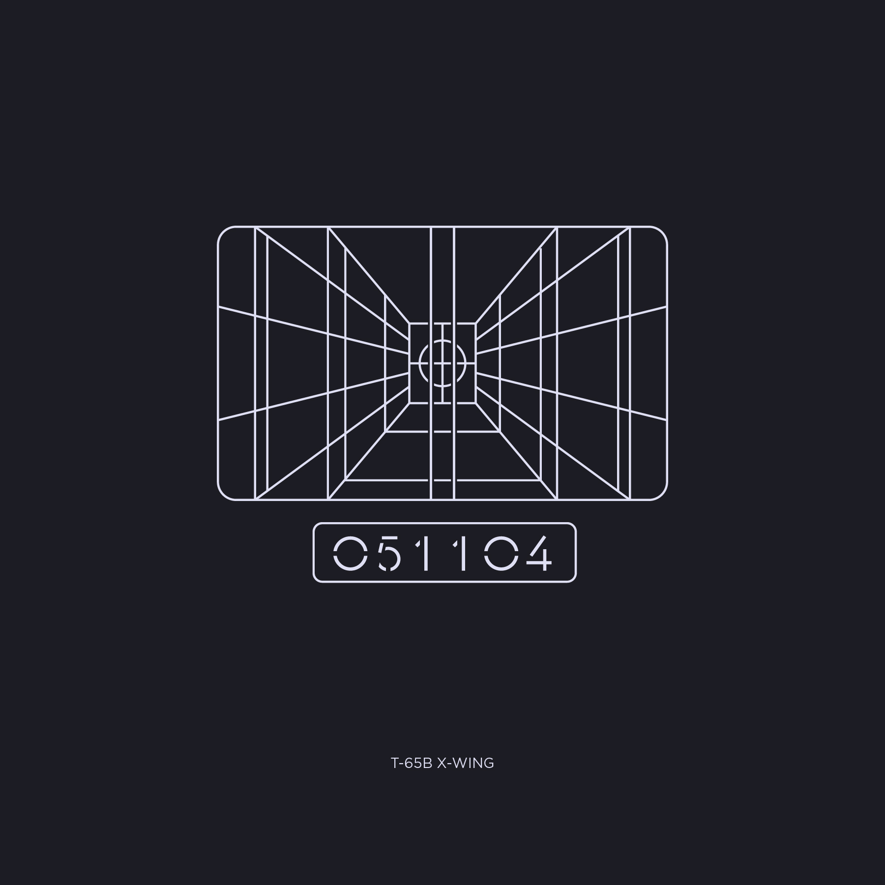
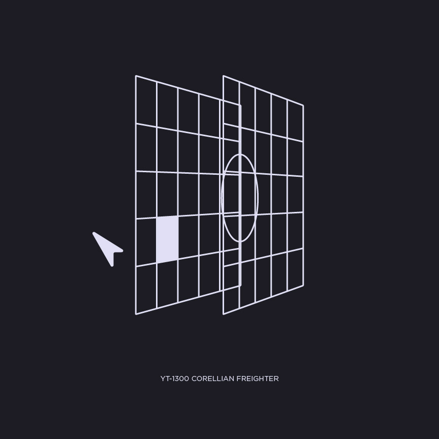
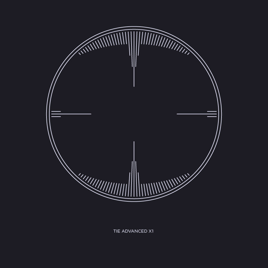
I have been working as a commercial artist, concentrating on graphic designer since 2010. During this time I ran my own clothing brand, worked in a small agency as a UI/UX designer, developed large format displays for Tylenol and Band-Aid, designed tshirts for Harley-Davidson, aided P&G develop tech-based home advancements, as well as worked out of my own studio where I have helped many small brands develop their aesthetic. Most recently I have accepted a role as Assistant Professor of Graphic Design at Doane University and run my studio out of Lincoln Nebraska. Outside of design I enjoy rock climbing, snowboarding, going to the movies, playing Dungeons & Dragons, and creating content with the Mof1 Network.
is a personal style exploration, utilizing the article Searching for Savanna by Pacific Standard . The article covers the topic of missing and murdered Native American women. I am thankful for publications that will write hard hitting and educational articles like this one. Written by Mona Gable and originally published by Pacific Standard.
Both the font, public sans, and columned layout symbolize the cold and authoritative nature of the government’s role. The illustrations feel violent as they break through the layout like those raising their voices for the killed and missing. The illustrations compliment the writing. Each based off a person or event that brought intense meaning and purpose into this piece.
is a project I started with my brother. At its core, it is serving as an outlet for our nerd interests. Through it, we are creating products like Dungeons and Dragons accessories and original board games.
The illustrations for Deep Space Here We Come were done by Jake Romano.
DETAILS
Spell Dice
An original spelling game where players spend points to buy dice with letters on them, they then roll their dice to see which letters they can use to spell a word to earn more points. It's a new experience based on traditional principles. A game that combines chance and knowledge.
In addition to developing the game and designing the packaging, I am also developing a mobile first companion site which will hold the rules and provide a way of digitally keeping track of your score.
Deep Space, Here We Come
An original co-op board game where you play as the crew of a transport vessel that is falling apart. Save your ship, before you’re hopelessly plunged into space and your alien cargo escapes.
Potions & Liquids
A digital Print & Play card set that will help your 5E players keep track of the abilities and usage of the items you are giving them. They contain unique illustrations, stats, and dice requirements. You can purchase the set on DMS Guild.
Spells & Cantrips
A digital Print & Play card set that will help your spell casters quickly see what spells they have available. Each card is uniquely illustrated and available in 2 themes, Lawful and Evil.
Beast Cards
A digital Print & Play card set that will help with random encounters and provide the stats a druid needs when changing into a beast.
is a podcast I started with my brother Dan Truran and friends Zach Wilkinson and Courtney Leach. The Mof1 Network picked up the show. There it continued with myself, Patrick Hill, Andrew Sale, Tracie Ching, and Rae Torres.
Our podcast is where design nerds go to get nerdy. In each episode, the main crew plays DnD, often alongside a guest designer.
Branding
The branding has had to evolve as the show transitioned from audio, to video, to live streaming. Though the core marks stayed consistent, their application and supporting materials had to adapt to the new stories being told.
Twitch Frames
Trying to stay ahead of the curve has meant continual growth and pushing our presentation to match the standards of the designers involved. The intent is for our animated frames add value and interest for our viewers.
Illustrations
Telling an audio story through visuals is a great way to expand the experience and bring it to new platforms, like Instagram.
is working towards impacting their community. With their programs that range from substance recovery, therapy, and food drives we can see great change coming from their open doors. Their location in Totowa, New Jersey allows easy access to areas needing help like Paterson. My work for them has included a wide variety of mediums and topics, with only a small segment represented here.
Branding for Emergence is unlike any other company or brand I've worked with. I am almost always creating logos for a one day event or series of events spanning only a handful of months. This requires a system that is not only relatable, but also attention grabbing.
The logos are often replicated on t-shirts, wall graphics, projections, or postcards. The versatility of each logo is tested when projected 5ft wide on a wall or 2in tall on a postcard.
Print
Shirts, posters, printed collateral, and so much more. Print is not dead, the impact of a physical item still holds power. Most projects for Emergence end up in a physical form.
Social
Social media is not only a great way to communicate ideas. It can build off of the experiences people are having in person. This allows the audience to experience a concept in person and have it follow them for days or prepare them for an event down the road.
Installation
One of my favorite things to do with Emergence is their large format installations. I work with them from concept to creation. The Elijah/Elisha consisted of hundreds of cut pieces of paper stuck to the wall with thousands of pins. This created a dimensional art piece people were excited to take pictures against.
is a project exploring how fast food and takeout is not only impacting our physical health, but the health of our environment. Each poster started by scanning the packaging of each meal and then collaging it within Photoshop. This body of work was brought together as a zine, printed and hand bound in my apartment.
KEYWORDS
ZineScanned ImageryDIYBook Binding
DETAILS
Why
During the height of Covid I was living in Upstate New York. The lockdown was strict and I found myself eating a growing amount of food from a drive through. I then moved to Nebraska where the situation became even more dire. As I put on weight, I also found myself under a mountain of wrappers and napkins. In that moment I realized my actions were not only effecting my health, but also my environment.
Process
Each poster, that would later become the contents of the zine, started by eating a meal. I would then proceed to clean off the packaging of grease and mustard. Those materials were then brought to a scanner where I manipulated the position and rotation of each object as the scanner proceed to capture it's image. The last step was bringing the distorted imagery into Photoshop where I created each composition.
Zine
I wanted the zines to have an impact that would stop the viewer and make them think about what they were consuming. To accomplish this, I separated a handful of the posters into to layers, printing one on paper and the other on a semi transparent vellum. This allowed the user to manipulate the images in the same ways I manipulated the scanning process. Finally a striking red waxed thread bound the zine.
is poster series with the goal of breathing new life into old concepts. They needed to grab eyes from a distance and attract younger audiences. All with the goal of conveying important facts about the Holocaust.
When deciding what historical topics to choose, the Holocaust stood out as particularly relevant. I focused on the Identification cards Jews were forced to carry and the incomprehensible amount of deaths that occurred in the concentration camps. It is as important as ever to be reminded of the evils we are capable of and strive to fight against them.
Aesthetic
Historical materials do not need to feel as if they came out of a text book. They should encourage further inspection and evoke a need to learn more. I utilized bold type and data driven compositions to create imagery that would stop passersby.
is a depository for branding projects that ended with the mark. Even though they might not be able to fill out their own page, here are a handful of logos I enjoyed creating.
KEYWORDS
BrandingLogosPodcastsChurchesArtists E-Sports
DETAILS
Represented Clients
Noble Folk Design Group, Gracepoint Gospel Church, Solid Foundation, Bill Truran, C.724, Ferrum Creative, The Shots For Likes Podcast, Live Construction Site. ReSalt, Labyrinth, C 907
is a depository for branding projects that ended with the mark. Even though they might not be able to fill out their own page, here are a handful of logos I enjoyed creating.
is a series bringing focus to those who have lost their lives due to their faith. It's purpose is to remove the politics that surround so many of the conversations of these events, aallowing the viewer to focus on those who were brave enough to stand for their beliefs. The project spans illustrations, installation art, and booklets.
What started as only digital illustrations has expanded into many different physical mediums. Most of these adaptations are founded in print making. Those shown on this page include screen printing on textiles, dimensional objects, and glass.
is a A HARDCORE-LOVING STRAIGHT EDGE-LIVING GUIDE TO NON ALCOHOLIC BAR OPTIONS. It's a passion project I started to combine two big parts of my life. Illustration & being straight edge. The above is one of three videos and one of eight recipes that I illustrated and compiled recipes for.
Honestly, I was jsut fed up with how bougie people were trying to make being sober. So I made a silly project to bring it back to my roots in sobriety, the hardcore music scene.
What
There are 8 recipes ranging from stirring some syrup into soda, to full fledged mixed drinks. In addition, to written directions some have videos showing the process to aggressive tunes.
and let everyone know! This page includes two projects. The first being an infograph providing many details around the vehicles within the franchise. The second project builds off of the first and was a daily study of the User Interfaces found in the films and shows. I then took this study and assembled a poster.
KEYWORDS
Star WarsUI FUI GUIIllustrationsVectorInfographPlotter
This was both an overly in-depth love letter to a franchise I've loved for near 30 years, as well as a way of finding new ways to consume media I've memorized. The UI study showed me how the latest films took inspiration from the original trilogy, how the prequels were being influenced by media around their release, and how the shows are now taking the previous UIs and reimagining them, but also build new aesthetics for their new stories.
Style
The infographic presents the data as if it were being shown through a ship's interface. This aesthetic propelled me into the UI series. The materials all take advantage of a mono line illustration style.
while watching Chef's Table, Francis Mallmann captivated me. To celebrate his work I created a menu and logo inspired by his episode.
KEYWORDS
RestaurntBrandingMenu DesignPrint DesignGold Foil
DETAILS
FORM
The menu utilizes a cylindrical form. This shape echoes the logs Mallmann uses in his cooking. The menus nestle within each other, representing tree rings, allowing a unique experience for the customer.
TYPOGRAPHY
I chose Reforma because like Mallmann it comes from Argentina. Designed in 1918, it was then refined over the decades. This acknowledgement of the past and effort to fit a modern context mirror Mallmann's cooking style.
NATURE
Mallmann's connection to nature is one of his most prominent traits. To incorporate nature a cross section of a tree hold's the menu and is to be placed on the table, waiting to welcome the customer as they are seated.
QUALITY
Mallmann above all is a master chef. With his unique approach to food comes the highest quality of dining. The gold leaf represents the silhouette of the Argentinian mountains, warmth of a roaring fire, and quality of his food.
PROCESS
The menus were printed on a thick watercolor paper stock. It was then soaked in water and curled into itself. After drying gold leaf was applied.
is an experimental installation work, meets performance piece, intended for Instagram Live. It's a reflection on the impact social media has on our mental health, the standards we put on ourselves, as well as those struggling due to social media.
If you have contemplated or struggle with self harm, please reach out to The Crisis Text Line now.
Experience
The work, as viewed, is a live streamed video feed of a monitor that contains a white background and a black symbol. The symbol slowly descends as the background gets darker, revealing a paragraph of text, and eventually engulfs the symbol. If the viewer hits the like button, the symbol and background reset.
Setup
The setup, as seen in the photographs and video, consists of an Iphone hosting an Instagram Live that is streaming a screen with a website displayed. The website has a webcam pointed at the Iphone. The webcam actively monitors the phone for the hearts that appear when a user "likes" the event. The website was built utilizing the javascript library P5.js
Edit
Edit 5-11-22:
Ran a second stream, with minor text styling making the word "LIKED" stand out. This was in an attempt to act as a queue. One person liked the stream resetting the setup, but I do not believe it was anything more than a follower jumping in and liking before they left. One viewer mentioned he thought it to be a social experiment, but didn't know what was happening.
Edit 10-24-22:
I took a break from the project to think about how to encourage participation. What I am going to try next is a green pixilated smiley face that turns into a grey frown. The art is referencing both the "face" from Nickelodeon and NeoPets. The face will also share speech bubbles as if interacting with the audience.
is an exploration of layout, illustration, and motion. It is also an exploration of the emotions we have all felt during this pandemic. It began when I was learning how to cope with Covid Lockdown in April 2020. Over a year later, as of when writing this, so many of these tongue in cheek jokes still apply.
Some images were made using Cinema 4D and After Effects, others were created with Illustrator and Photoshop.
Presentation
This series was one of the major installations in my solo show What's Left? at Doane University and was printed within a zine that was given to guests who attended the show.
As with branding, Tshirts need to be both iconic and instantly recognizable, while working in as few colors as possible. With this type of work I often start with only black and white, adding color as a last accent step.
is a unique clothing brand out of Orlando, Florida. Their products are based on delicious sandwiches and the people who eat them. The original branding was created by LainLee III, but I have since created many marketing tools, t-shirt designs, and printed collateral.
Deli Fresh Threads is one of my longest running and most fun clients to work with. The owner has a well-focused mission and comes to me with some of the most creative ideas.
Anthony of Deli Fresh Threads first came to me because of my experience working with screen printers and my history of merch design. Having worked with Anthony of Deli Fresh Threads for many years now we have helped the brand grow in the way he runs events and sells wholesale. In addition to strategy and tshirt design, the work has included banners, postcards, and other tools to help spread the brand.
Testimonial
Working with Noble Folk Design has been great. They take the time to listen to what our needs are and produce quality work. They provide insight and use their years of design experience and knowledge to make sure you get the perfect design. I have used them to design my various business needs from postcards, banners, posters, and T-Shirts. You can’t go wrong with their work. I recommend and will be using them for future business design needs.
is an expression of my love of the films, the books, the games, and now the show that make up the Lord Of The Rings experience. Here is my fan project, a map so you too can Tour Middle Earth!
KEYWORDS
MapLord of the RingsMiddle EarthIllustrationsPrint Design
DETAILS
Cover
The map can fold up into a little booklet that could fit in a glove box, like those great road trip maps of the 60s & 70s
Location Illustrations
On the back of the map I listed out details of many of the locations, each with a unique illustration.
Each floor of the Whitney is an amazing experience. You enter a large open room, overwhelmed by the caliber of work filling the space. When your eyes lock onto a single piece of work, you approach it.
My homepage recreates how they presented their art and presents my work in a large open space.
Project Detail
After you approach a work in the Whitney, all other works disappear as your eyes absorb the details. For me this piece was My Egypt by Charles Demuth.
Once you click on one of my works all the other pieces disappear, allowing you to focus on the details of the project.
Project Info
If the artwork impacts you, you can move away from the work and read the Object Description.
If my work captures your attention, you can read about the project's details by clicking the Project Info button.
Features
To create a unique experience my website offers a cursor that interacts with the colors and grows when you pass over an interactive element. The site can also be experienced in three different modes. There is a dark mode, light mode, and party mode. The party mode generates a random color for the background. The modes all effect how the work throughout the website is presented. Clicking these modes will also generate the hex value in the footer. If you love a particular color you can copy it to your clipboard by clicking the icon.